Telling the story
To organise the data, we first will group it by the dates and take the mean values. We can also get the forecast values from our Prophet model created earlier. We will add our datasets into a DataFrame and combine them.Documentation
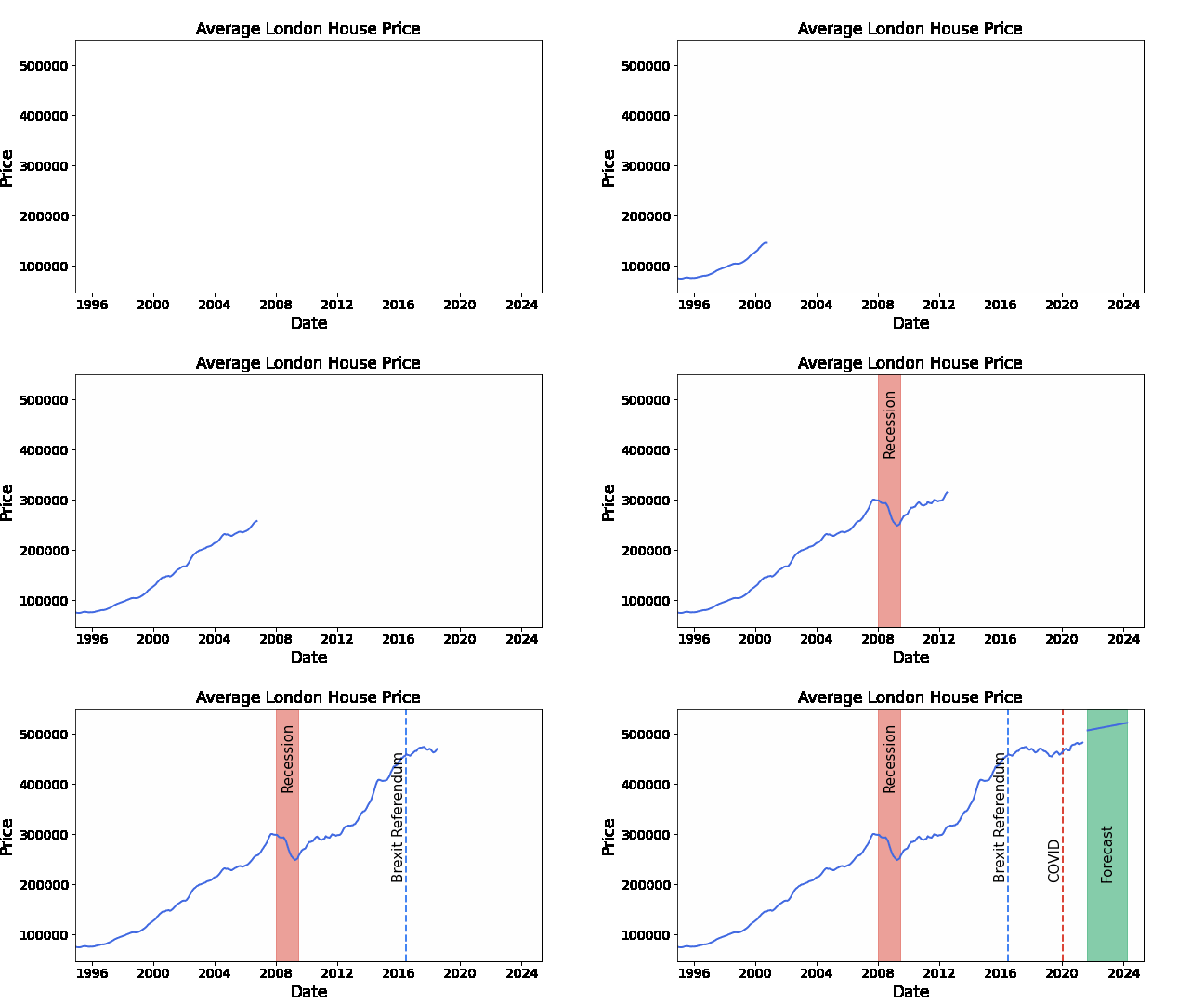
Putting this into a GIF helps a great deal with data storytelling. It lets the user follow along with the journey of increasing house prices with plot twists written out as they occur.
We have defined a function that by passing in the date parameters along with the DataFrame we will create a line graph using matplotlib (pyplot). We also add aids to our story being prompts appearing on our GIF using if statements to attribute different characteristics to the plot points.
This plot is formulated by individual data points we will create using a for loop going through each item in our date range column.
The for loop saves our gif to file however we can also insert his back into our notebook using and HTML image tag (specifying the source to be our GIF).
